


If you follow color trends, especially in the design world, you’ll know that Pantone has for the first time, released not one, but two colors of the year for 2016.
Introducing “Rose Quartz” and “Serenity”
Pantone 2016 Color of the Year
I wasn’t too fussed on last year’s color of the year – Marsala (a burgandy grape color), but I am loving the tones of these two pastels and how they blend beautifully together. Rose Quartz is “a warmer embracing rose tone” and Serenity is a “cooler tranquil blue”.

Pantone color swatches – Rose Quartz & Serenity

Pantone Fabric Swatches – Rose Quartz & Serenity
Pantone Color of the Year Around the Home
Here are some inspiration pics from around the web, using these colors. Click the pictures to head over to the original blog posts I sourced these from:

Image via Kitchen Studio of Naples, Inc.
Photo via @eddiezs

Photo via Blogarredamento.com

Photo via Design Milk. Click through to see where each item is from.
Miss Mustard Seed’s Milk Paint Inspiration
In our range of Miss Mustard Seed’s Milk Paint European collection, two colors stand out to me, to create a similar look for this Pantone color of the year vibe.
Arabesque:

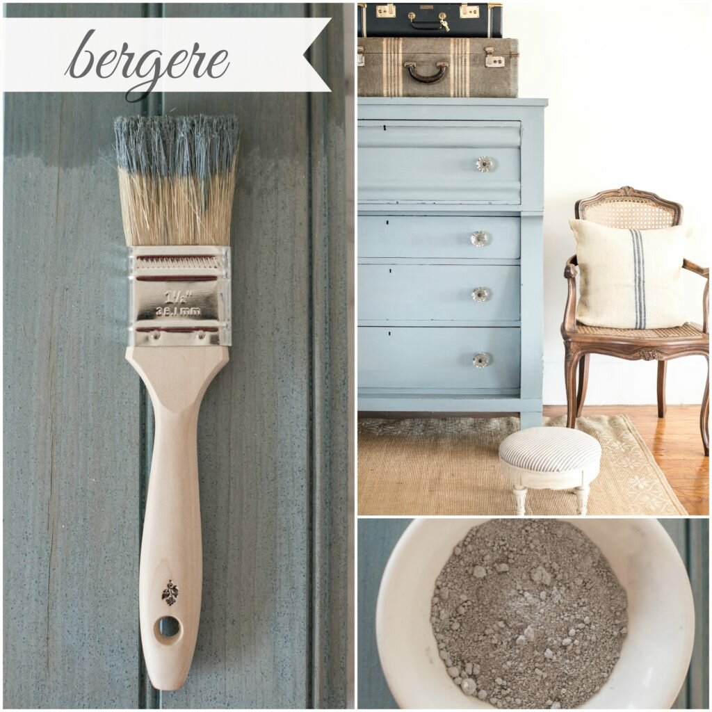
Bergere:
I think they’d look lovely together …

Miss Mustard Seed’s Milk Paint – Arabesque

Miss Mustard Seed’s Milk Paint – Bergere
My Own Makeovers:
Here are some of my own furniture makeovers I have done in these colours:
Arabesque – Antique Drawers Up-cycled into Shelves
Bergere – Coffee Table with Gray-wash Wood Top
Bergere – A Tall Boy Drawer Set Transformed from Orange Pine
Colour Matching:
Now, I know the MMSMP colours are not exact matches to the Pantone colours, but you get the idea of creating inspiration for these pretty tones. If you wanted to color match more accurately, experiment a little with adding some other MMSMP colours into the mix. The Bergere could be a little more stronger blue to match Serenity – try adding some French Enamel, for example.
What do you think of these colors? Are you influenced by the changes in seasonal colour fashions, or do you prefer to stick to your own style and colour expressions?
I’d love you to comment below and subscribe for further updates, specials and promotions.
Happy 2016!
Sharon.
PS. You can share this image to your Pinterest board:
We are authorised retailers for Fusion Mineral Paint and Miss Mustard Seed's Milk Paint in Australia. This blog post may contain affiliate links.


10 Comments
Megan from The Junk Wave
January 4, 2016 at 6:53 pmI am a stickler for colour I like (I am very loyal). But, I am an extremist so I am either bright tropical or the deep/rich Georgian burgundy and royal blue. I would NEVER have considered putting a pink and blue pastel together but these pics are absolutely delicious and have nicely challenged my aesthetic thinking.
Just the name Arabesque makes me want to dance.
I am willing to try the colours together and see how it “feels.”
IRestoreStuff
January 4, 2016 at 7:27 pmGood on you Megan. I’m pretty loyal to my blues and whites, but like you said, this combo was a nice surprise.
Ewa from Kredowe Meblove
January 5, 2016 at 7:35 amVery interesting post. Thank You!
First I was taken aback, now I find these colors and that combination very interesting. I would like to see it on one piece of furniture!
IRestoreStuff
January 5, 2016 at 8:10 amI was thinking the same thing … I might have to look for the perfect piece to try it on.
Marisa Robinson
January 12, 2016 at 10:11 amI am so obsessed with Rose Quartz it’s pink perfection! I love the drawers and the life both colours give to them! Thanks for a great read and interiors inspo x
Oksana
January 12, 2016 at 11:01 amI love this year’s pink! So lovely! And I absolutely adore the color combinations you give examples on here! Oh, with that grey shade,perfection!❤️
sara delaney
January 12, 2016 at 7:00 pmFave colours! Off to get my paint brush pronto!
xx
Kate
January 12, 2016 at 10:25 pmI am loving these colours! My favourite piece here is the Hai Chair – I want! Kate, Wondrous X
Eva
January 13, 2016 at 6:49 amYour blog is beautiful. I just came across it! Can’t wait to see more. The colors are wonderful, even though they are not quite our style. I’m amazed at how well they fit into all kinds of surroundings. Would have not thought of that!
Master Scandinavian Design with these Simple Hacks
April 29, 2016 at 7:45 am[…] on those cold neutral colours, this design is focused on adding a bit of softness in its designs by using gentle tones that provide tranquillity in the living space. This way they are giving the sterile environment a […]